Neumorphic Haptics
WatchReturn of skeuomorphism for touch feedback. Our verdict: Technically novel, but risks creating visual noise. Better suited for accessibility than mainstream UI.
In the 0.3-second window between a tap and a response, we design the physics of feeling. This is where interfaces stop being static and start becoming alive. Our journal explores the granular decisions behind kinetic design—beyond the gimmick, into the grammar of motion.
A curated critique of emerging techniques—where we see genuine utility versus fleeting spectacle.
Return of skeuomorphism for touch feedback. Our verdict: Technically novel, but risks creating visual noise. Better suited for accessibility than mainstream UI.
Using noise algorithms for organic, non-repeating textures. We implement via custom WebGL shaders to ensure zero performance overhead on static frames.
UI sounds anchored in 3D space. In Aether Drift, notification chimes move radially from the action source, enhancing spatial awareness.
Animating weight/width axes for emphasis. Our pipeline: Figma variants → After Effects → Lottie. Reduces asset weight by 70% vs. sprite sheets.
Using motion to manipulate urgency. Our framework: All deadlines in animations must be user-acknowledged. No loops for anxiety.
Tactile feedback timed to the frame it's drawn. A technical challenge on Android due to hardware latency variability.
Motion isn't decoration. It's the language of cause and effect. Here’s how we architect it.
We don't test on flagship devices. We test on the "middle" devices: 3-year-old iPhones, mid-range Androids. If an animation drops frames there, it's not robust. Our performance budget is a hard limit, not a suggestion.
Linear vs. Ease-Out: The difference between mechanical and organic.
A fast, linear motion feels urgent and mechanical. A slow ease-out feels considered and calm. We map easing curves directly to the emotional weight of an action. Deleting a file is a fast ease-in (decisive). Opening settings is a slow ease-out (reassuring).
"The curve is the character. We don't just animate properties; we animate intention."
This is not lag. It's a manufactured breath. In a puzzle game, we held a 100ms delay before confirming a successful match. Without it, the feedback felt greedy. With it, the player felt the system was processing their input.
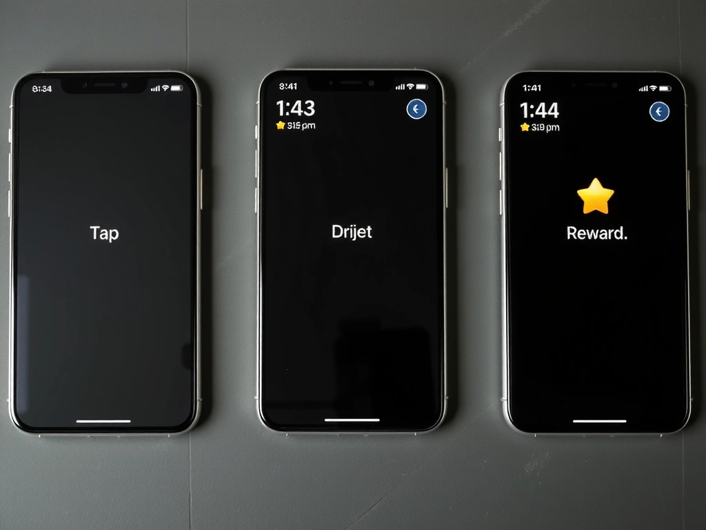
Tap → Hold → Reward: The anatomy of anticipation.
The abstract becomes tangible. Here is how a creative intent transforms into a living interface.
We don't start with features. We start with emotions. Our questionnaire is designed to uncover the core feeling a user should have—not just what they do, but what they should feel while doing it. This maps directly to our motion principles.
This is our most critical tool. A narrative description of every interaction: "The button reacts to cursor proximity with a slight, welcoming lean—not a press. The click sound originates from the point of contact, not the button's center." This script is built in Figma, then coded.
We build the logic first. No polish. We test timing, feedback, and state changes in a raw environment. This is where we catch if a 0.3-second delay feels right, or if a 500ms animation is simply too long.
The final handoff includes a performance audit, a Lottie file for iOS, a style guide with timing specs, and a CSS/JS snippet library. This ensures the motion system is maintainable long after we're gone.
Start a ProjectThe perception of dropped frames. We don't measure it; we feel it. Our internal threshold: if an animation stutters on a 2-year-old device, it's jank.
Using mass, stiffness, and damping to drive animation. Creates natural, weighted movement. We use it for button presses and list item reordering.
The 16.67ms per frame at 60fps. Every element—physics, rendering, input—must share this budget. We allocate and trim ruthlessly.
The rate of change over time. It's not "fast" or "slow"; it's "mechanical" or "organic." We choose curves based on the user's emotional state.
Drawing the same pixel multiple times in a frame. A common performance killer in layered UI. We use WebGL for complex backgrounds to avoid this.
Linking a user's goal to a specific motion property. Not "fade in," but "make the user feel the element is arriving, not appearing."
We've made these mistakes. Here's how to avoid them.
Everything moves. Nothing feels important. The user is distracted from the task. Avoid by: Defining a hierarchy. Only 2-3 primary elements should have keyframe animations.
A button slides in, but a notification pops. The user's brain has to relearn the world's rules. Avoid by: Creating a "motion token" library. A button's bounce should be the same across the app.
A beautiful loading sequence that can't be skipped. It's a wall, not a guide. Avoid by: Designing animations to be interruptible and respecting the "Back" button's state change.
Vestibular disorders make motion sickness a real risk. Avoid by: Implementing a global toggle that strips animations but keeps functionality intact. We test with this on daily.
If your product's interaction is a conversation, we help make it articulate. Let's discuss the physics of your interface.
Start a Conversation